The Evolution of Buffer for iPhone’s Change Schedule Functionality
There has been many iterations since 2013, download Buffer on iOS to check out where we are currently.
With the latest version of the Buffer iPhone app hitting the App Store it brings with it the ability to change each profiles schedule from right within the app. You no longer have to go to the web app to tweak the times within your schedules.
For a long time it has been one of the most requested features we’ve had from the very first version of the iPhone app and i’m personally excited like we all are at Buffer to finally have this in everyones hands.
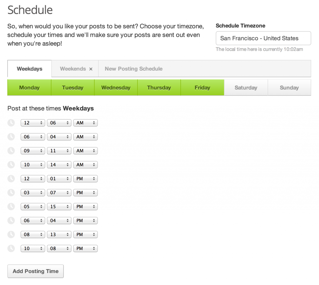
Change Schedule functionality on web
The UI for changing schedules within the web app contains the following elements allowing the user to make changes to their schedule for each of their profiles.
– Buttons to toggle days off and on. – Ability to add a time to a schedule. – Ability to remove a time from a schedule. – Ability to edit an existing time within a schedule. – Navigation to switch between multiple schedules. – Button to add a new Schedule to a profile. – Option to delete a whole schedule apart from the first one.
That’s quite a lot of elements and functionality to fit onto a iPhone screen and not only that the web app saves the schedule after a short period of time after a change is made. For iPhone we’d want a “Save” button somewhere just to add to that list.
Many iterations
Due to the number of elements required to change schedules within Buffer it’s taken a while and more than a couple of iterations of it to get it to this point. A point where we feel it works well and compares to the web app version. Not to say that either the web app or the iPhone version is perfect.
I’ve picked out a couple of iterations throughout the development of the Change Schedules functionality, I see these as the defining iterations that moulded it into what you see now in v2.5 of our app.
Iteration 1
I actually started playing around with adding this functionality back when I was freelancing for Buffer and working on version 1 of the app back in 2011.
Version 1 had a single table which had each schedule visible as a section with the schedule title displayed in the section heading. This was great for seeing everything on a single view but made adding & editing times tricky. Editing the schedule to amend days wasn’t intuative and would send the user to a brand new view to pick the days.
Profile selection throughout version 1 was done by swiping the views from left to right to navigation between the profiles. This was ok when you have a couple of profiles but when you had more than 3 or 4 then it become slow and tiresome.
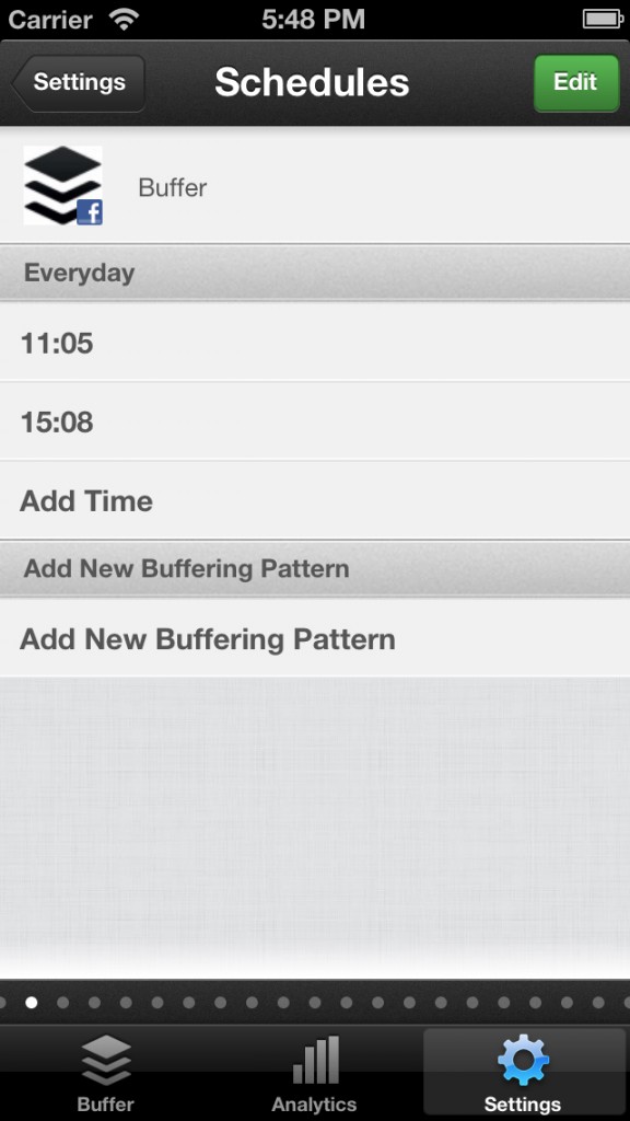
Iteration 2
Profile selection was an issue and caused confusion so we introduced a screen to allow the user to select the profile they wanted to tweak the schedule for.
Selecting the profile would reveal the schedule of that profile within a new view much like iteration one without the odd swiping navigation.
Iteration 3
We then started to move our focus onto Version 2 of the app with the help of Luke Beard to bring the design of web and iPhone in line with one another. Changing Schedules wasn’t high priority as we focused on improving existing functionality and introducing the ability to connect profiles via the app, which back then was much needed.
Change Schedules sort of become a fallback “hobby” task that i’d dip into when I had some free time aside from other feature additions and bug fixes. The first iteration that sat within Version 2’s design closely resembled iteration 2 with a new lick of paint.
Adding new patterns or days was all done through a separate view, much like the iterations before.
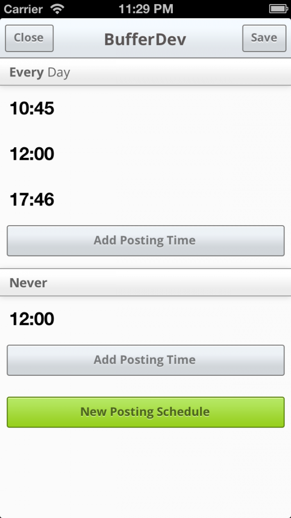
Iteration 4
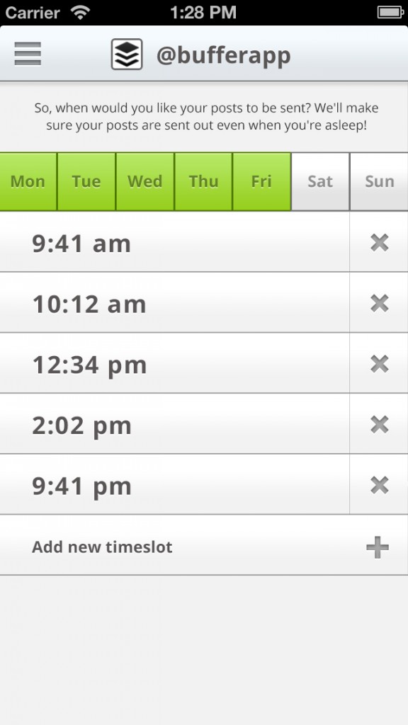
Day selection was something that was slowing editing and creating new schedules down. I toyed around with the idea with having buttons to toggle days off and on within the view for a while and suddenly on a train I did some maths and cracked on with designing something that resembles whats in the app today.
The iPhone screen is 320 pts wide and Apple recommend that buttons are no smaller than 44 pts x 44 pts in size. 320 pts / 7 days equals 45.71 so we could fit all of the days alongside each other without to much of an issue with taps being missed by iOS.
We also introduced arrows to flick between schedules rather than showing them all within the same table. This was partly inspired by iOS 6’s Calendar app allowing you to switch between days with ease using two buttons alongside the date.
Profile selection was still done by a separate view and it was accessible from Settings through a “Change Schedules” button.
Final Iteration
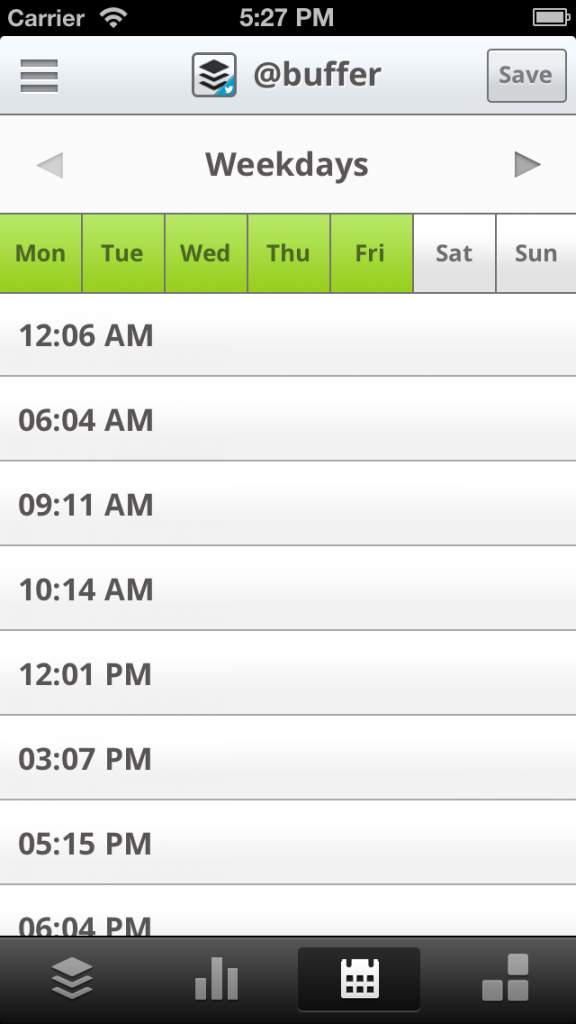
We felt that the design was coming together and it was nearly ready to push to our iPhone app users. One thing we had played around with quite a bit was the location where users could find the Change Schedules functionality.
The web app shows 3 main tabs Buffer, Analytics and Schedule so after trying a couple of different locations for the Change Schedules functionality we decided we should have it sit within the bottom Tab Bar. This also meant we could use the same profile selection we use throughout the app in the side menu.
Once we had moved it into the tab bar it we found it made complete sense and it reflected the exact options we have within the web app.
Next steps…
We’re continuing to work on the most requested features our users have but we’ll be keeping an eye out for feedback about changing schedules within the iPhone app to make any improvements to make the process even easier.
If you have any thoughts on how we can make it better or you have any specific questions feel free to post them in the comments or drop me an email via my contact form. I’ll be happy to answer any questions you have.